Sunday, June 28, 2009

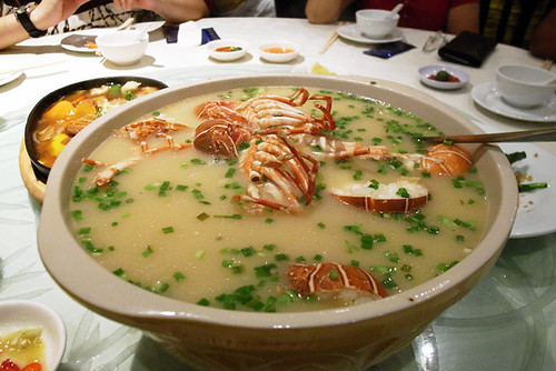
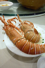
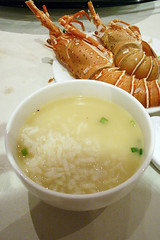
lobster porridge

food270609a
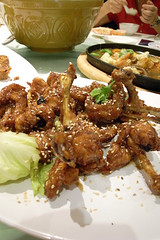
I normally have an aversion to the teochew style porridge where the rice grains are still intact and forms a sedimentary layer distinct from the liquid portion, preferring the more viscous and homogenous cantonese style congee. My main contention with the teochew variety is that, it just feels like cooked rice soaked in water, as if someone had switched off the rice cooker halfway. But at Orchid Live Seafood, I'll make an exception. Well, only becuase there's lobster inside the porridge and the rice is soaking in a rich golden lobster stock. The lobster meat, only cooked briefly in the porridge just before serving, was fresh and succulent. Another of the chef's other signature dish is the lollipop chicken that tastes like pork ribs (not some Heston Blumenthal recipe, just lots of seasoning), which I like, in a junky kind of way.

Located in a non-descript row of shophouses off Yio Chu Kang Road and well known among foodies as the restaurant formerly at the Orchid Country Club (hence the name), the restaurant was packed as usual. The premises was cramped and awkwardly laid out; a straight row of 10-seating round dining tables line the length of the narrow shop space with some diners seated back to back with another person from the neighbouring table. A constant Chinese-restaurant-buzz filled the room (which I always enjoy), occassionally punctuated by the chef's insults du jour being hurled from the kitchen to the unfortunate staff outside struggling to serve plates upon plates of food.With the weak airconditioning and a pot of hot porridge sitting on almost every table, the air is slightly stuffy. The place was almost charming, perhaps lacking in some campy chinese restaurant elements like chrome framed chairs with maroon velour cushions, plastic plates and bowls with Chinese motifs, and pink serviettes.

Be sure to call and make a reservation if you want to pay a visit. The number listed on their website seems to be the chef's mobile number, so prepare yourself for a curt verbal exchange.
food270609bfood270609cfood270609d

Orchid Live Seafood
16 Jalan Kelulut ( off Yio Chu Kang Road)

Saturday, June 27, 2009

cdg homme+ ss10

PhotobucketPhotobucketPhotobucketPhotobucket
Moving on from last season's dark moody tones, the ss10 CDG Homme+ collection is a sumptuous feast of summery hues and rich textures. Patchwork plaid jackets are matched with loose floral print pants. On some jackets, ties are stitched on as part of the patchwork and looking as though they were casually slung over the shoulders. Pockets are articulated as seperate colour panels or outlined with a contrasting trim. Trompe l'oeil bow ties can be seen on shirts, sometimes humorously juxtaposed with a real bow tie worn with the shirt. There were also some short skirts (or skorts?) layered over pants, which are still a bit of a hard sell, even if this is the fourth season in a row where skirts have appeared for the homme+ collection.
Although lacking in the tricky tailoring we saw in last season and the usage of many recycled classic comme shapes, this is by no means a poor collection. Beneath the cacophony of the layering and styling is a rich picking of great individual pieces that would fit right into any fanboy's wardrobe.

Friday, June 26, 2009

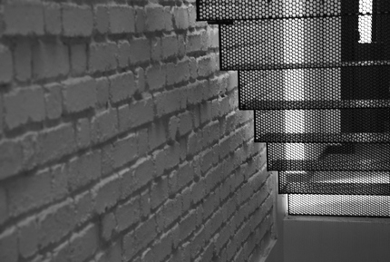
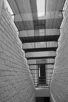
Folded St(air)

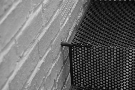
It's a great joy for an architect to be able to create or even just to see a wonderfully complex and beautiful joint, but sometimes, this tectonic ecstacy is derived from something quite the opposite, something so severely simple that it takes great guts to conceive of it and even greater guts to implement it.

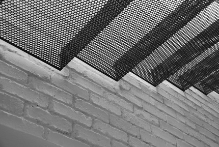
Folded Stairs by Kevin Mark Low

"mild steel.

The staircase for the aviary house was designed in one straight run along one side of its length in order to maximize room space since the property was long in depth. In order to bring light to the lower stair level, the upper flight had to be somewhat transparent to the natural daylight allowed in by a skylight up top. An added design task was created: the stair had to seemingly float in the space of its bounding walls. The solution was found in perforated steel sheets, cut to width and folded to the dimensions of treads and risers for the provision of structural integrity. The folded stair was suspended between the stair walls by mild steel pins located at the junctions where each tread met the top of their associated risers. "

kevinlow stairs (3)
kevinlow stairs (1)kevinlow stairskevinlow stairs (2)

Small Projects Kevin Mark Low

Thursday, June 25, 2009

red peristil

wandering around on our last day in Split, Croatia, we chanced on the Neranka Gallery, run by a charmingly genial painter and graphic artist, Pavo Majic. more importantly, he was one of the generation of artists who lived in Soviet-era Croatia, captivated by the perceived cultural vibrance and edge of the capitalist West.

he introduced to us to the work of Pave Dulčić and others who performed a piece of intervention art on Split's symbol, the Peristil of Diocletian's Palace, in 1968. the group painted the stone courtyard of the Peristil a red colour in the early morning, standing in stark contrast to the weathered granite of the Palace, as a reaction to Croatia's position within communist Yugoslavia. Dulčić later was arrested, prosecuted and committed suicide. today the stones are their original colour.

red peristil 1

having come into contact with Soviet Constructivism in Rodchenko and Popova at the Tate Modern, i was struck by how this emotive and defiant piece stood at the other end of the scale from the mechanical art advocated by the Constructivists. at the same time one is aware that today as we look back on these works their social contexts have fallen away: they have been made less intense, transformed from symbols of social change into relics of a recent past.

more on Pavo Majic and the Neranka Gallery later...

Wednesday, June 24, 2009

recession rings

tithi paper rings

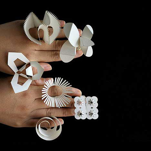
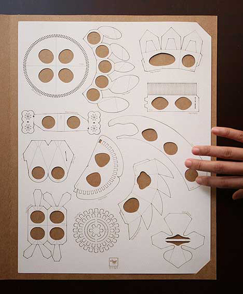
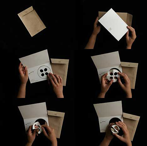
A collaboration between London's Tithi Kutchamuch and Nutre Arayavanish, the All Year Rings are 12 laser-etched paper rings, each having a different floral design representing each month of the year. The rings come in a single sheet from which you pop out the one of your desire.They also come in a birthday card version that you can send to loved ones as a gift. Cheap thrills in these dark economic times, I say wear one for every month of the recession, well, at least till you can afford a real gold ring.

tithi paper rings (4)tithi paper rings (3)tithi paper rings (2)

tithi.info
nutrejeweller

Monday, June 22, 2009

bo innovation x anthony bourdain


While chatting with a friend today, we started talking about Bo Innovation and he alerted me to the Hong Kong episode of Anthony Bourdain's No Reservation where the chef, Alvin Leung, appears in one of the segment (4.00 onwards) serving Bourdain at his restaurant. Recently awarded 2 Michelin stars, Leung is one of the first people to radically reinterpret Chinese cuisine, deconstructing classic Chinese dishes and applying unconventional cooking methods (to avoid the term molecular gastronomy). Having only seen pictures of Wong (with blue hair, tattoos), he is every bit the character that I imagined him to be, perhaps a little more eloquent and acidic. Shock, confusion and delight are the keywords to describing the experience of dining at Bo Innovation. Having been there a couple of times last year, the taste of lap mei fan ice cream and oxtail caviar xiao long bao still lingers in my mind, I'm yearning to go back.

Sunday, June 21, 2009

Jil Sander SS10 men


PhotobucketPhotobucketPhotobucketPhotobucket
Perhaps one of the safest collections that Raf Simons has put out for Jil Sander, he sent out boys styled in the image of the artist Tsuguharu Foujita with his signature bowl cut hair and circular glasses. The palette is starkly monochrome with the occassional pops of pale pastels. A good number of pieces were printed with drawings by Foujita. Stripping off the embellishment, we see a classic Jil Sander minimalism, well cut suits, pants and shirts in a monochrome palette. The collection is perhaps more Foujita-themed than inspired. The pieces are easy and the collection as a whole stylisitically unchallenging; pure Jil sander you might even say. It will surely translate well into showroom sales in a time when stores become ever more conservative for their buys. But the question is, how many Jil Sander white shirts and black pants does one really need?

kith

food210609g
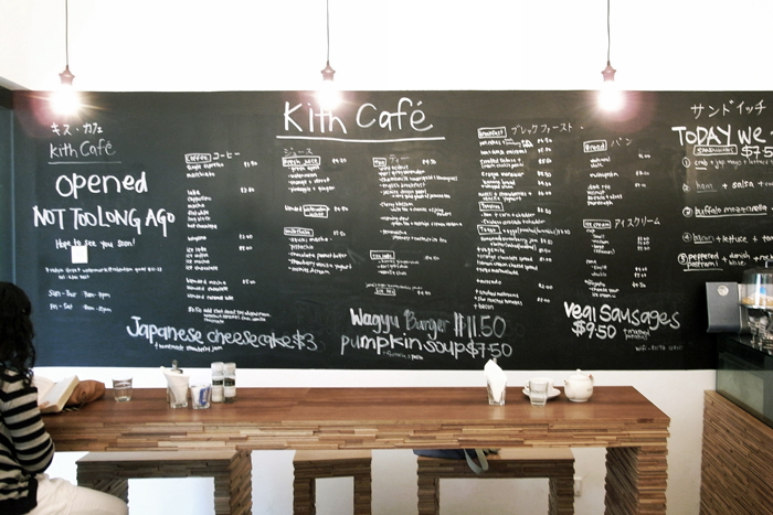
Kith, as the name suggests, is a small and cosy neighbourhood cafe along the Singapore River at Robertson Quay, where the patrons and operators are like close friends and people are greeted by their first names. Even though the cafe is situated right smack in the middle of Singapore's clubbing central, it boasts of a surprisingly affordable menu consisting of a good selection of coffees, teas and deli eats. A range of artisanal ice cream is also available in a variety of trendy flavours.

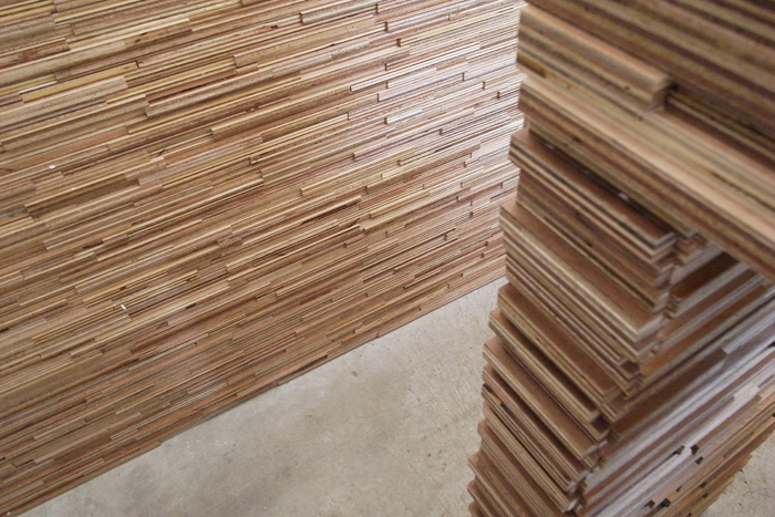
The cafe is small but cosy with the interior dominated by a blackboard running along the length of one of the walls and the space is washed in ample daylight and complemented by an array of bare mirrored bulbs. The simple furniture and fittings made from plywod are adorned with strips of plywood turned on their sides such that the layers of wood are seen, forming an irregular barcode pattern ( that is so rampant in architecture and interior design now), with the warm hues of the wood are set against the white-washed walls.

food210609a1food210609b1

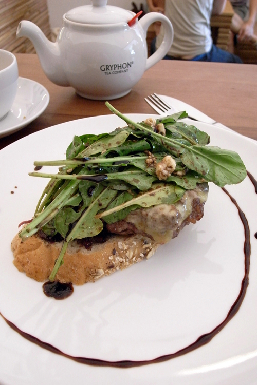
On this visit, I had the wagyu burger, which technically is not really a burger. The wagyu patty was served open-faced on a whole grain toast with a bed of sweet onions and topped with melted cheese and a rocket, blue cheese salad, finished off with a dash of balsamic. The whole thing was destined for success with the promise of a good composition of flavours and textures but unfortunately, the patty (which I think is the critical component of a burger) didn't quite make the mark. The patty, though pink in the centre, was rather dry and lacking in meaty flavour that ne might expect from wagyu. The reason is likely due to the fact that the patties were pre-made and left to sit at the counter ready for the "burger" to beassembled at anytime. It would be perfect if the patty could be cooked only upon ordering, but the lack of space does not allow much actual cooking to occur in the cramped service area. (A lone electric stove is tucked at the corner beside the back door and the microwave oven is installed at shoulder height at the back of the cafe behind the counter meaning pre-made food had to be microwaved in the full view of the patrons).

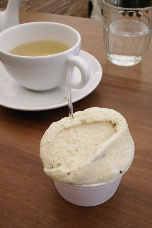
I spent the afternoon sitting there doing some reading and sipping tea. I had the mint citrus tea and the last time I came, I was served a pretty excellent earl grey chai latte. I rounded off my visit with a scoop of pistachio ice cream which had delightful chunks of pistachio nuts in it.

The casual atmosphere and friendly people at the cafe makes it pleasant place to just hang out and while the hours away. It has potential for greatness but still a few steps away.

food210609cfood210609d

Kith
7 Rodyk Street
Watermark@Robertson Quay

Saturday, June 20, 2009

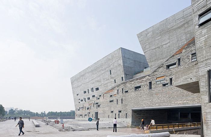
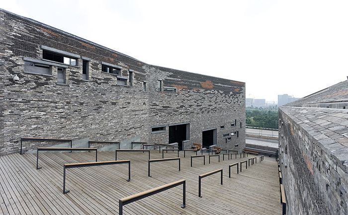
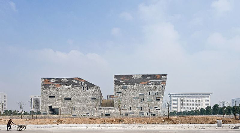
Ningbo Historic Museum

Photobucket

"In the eastern part of this province, near the sea, people suffer from typhoons, which cause many houses to collapse. They don’t have a lot of time to rebuild them, so they put the bricks back together randomly. I find the resulting architecture very beautiful."
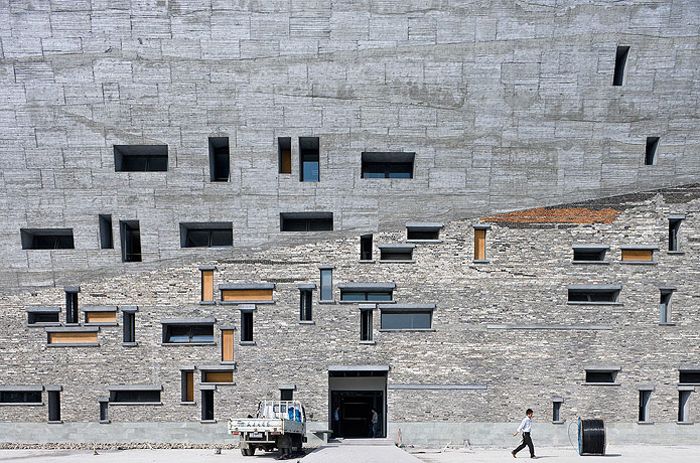
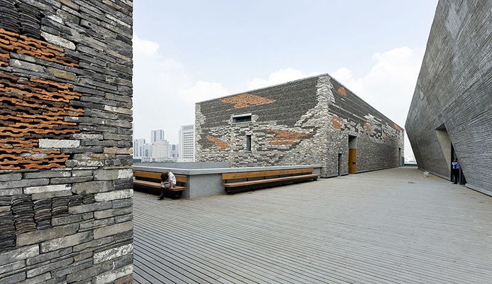
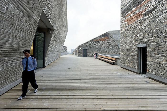
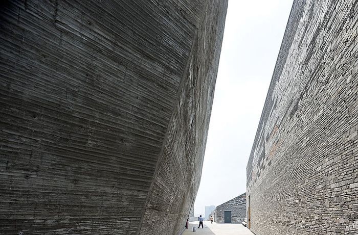
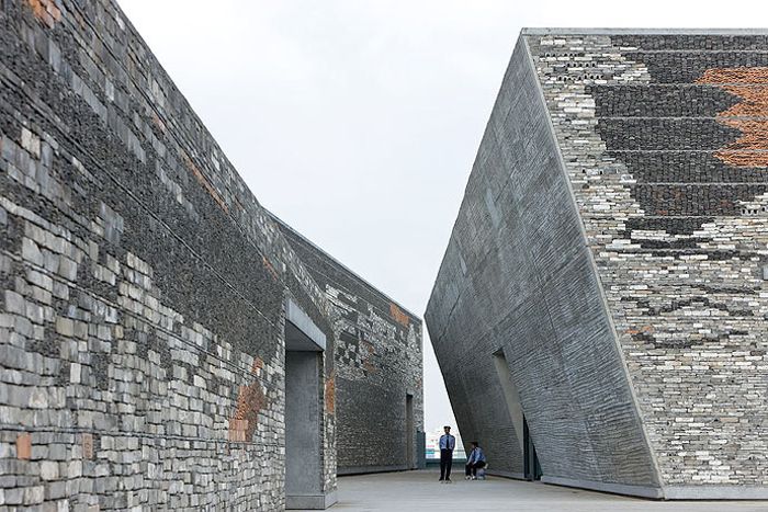
Playing off the vernacular and the modern (the NOT tradtional), the Ningbo Historic Museum by Wang Shu is akin to an archaeological slice through the urban development of the city. Reappropriating the local practice of reusing old building materials for construction. The result is a fine grain patchwork of local bricks and tiles (collected from demolished traditional houses), juxtaposed with brutal volumes of raw concrete; as if crafted by nature over a long period of time. The random windows suggests the taking apart and reassemblage of whole sections of the traditional brick houses into this bigger, monumental (almost inhuman) tomb.

The Ningbo Historic Museum is at once a nod to the history of the city of Ningbo, and also a stinging critique of the relentless destruction of the existing urban fabric in China in the name of modernity and progress.

"I want my architecture to tell people what life in this city used to look like. Ten years ago this was a very beautiful harbour city. Now everything is demolished. So I collected and recycled building materials from the area. For this reason, even though I won the competition, local government officials didn’t like my design....They think theirs is a modern city that needs a modern building. But when the building was finished and the people saw the real thing, they loved it."

" I did design the pattern on the walls of this museum. When the construction process started, people worked behind a scaffold. It was very secretive. Nobody saw what was happening, including me. Obviously, the craftsmen changed my design, but when they took the scaffold down I loved it, precisely because it was beyond my control."

I like how the objet trouvé nature of the old building materials used for the building, is extended to the construction process. The architect sets parameters but does not know exactly what the final product will look like, as much as he (pretends) to want to predict and control it; it is left to chance. The construction process becomes a chance operation.

PhotobucketPhotobucketPhotobucketPhotobucket
photographs by Iwan Baan

More on Wang Shu and his Amateur Architecture Studio
Local Hero | An Interview with Wang Shu
Mark Magazine #19 April-May 2009.