Wednesday, September 30, 2009

fika

fika 1
Nordic food places, except for the Ikea cafe, have never done particularly well in Singapore. I know of 2 other ones that have both ceased operation, one being Skål at wheelock Place (if I remember correctly), the other was the short lived ABOF which was located at a corner of Millenia Walk where Palm Beach Seafood is now. Both never quite made a name for themselves during their short existence, and ABOF was just foolishly over ambitious. So it was with great surprise when I came across Fika, a Swedish cafe, in the midst of setting up along Arab Street some months ago. Setting up a Swedish cafe in the Arab Street area in a sea of Arabic restaurants and shisha bars might sound like a cultural mismatch but with "Halal Swedish Cafe" emblazoned on the shop canopies, it is perhaps less of an oddity than one might imagine, though only after the initial mental discombobulation.

Fika, is a social institution in Sweden. It generally refers to taking a break, most of the time a coffee break. Its origins came from a play of the word kaffi which was an older form of the kaffe which means coffee in Swedish. I've also heard another version which says the fika actually means kaffe(i) och kaka which means coffee and biscuits. Fika seems like too obvious (maybe cliche) a name for a Swedish cafe, there's one other Fika cafe I know of which is at Brick Lane in London, and I'm sure there are more of them around, not that I'm complaining.

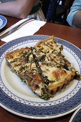
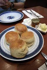
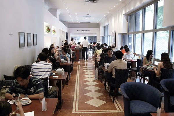
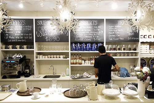
Finally got a chance one evening to pay a visit to Fika (the one at Arab Street) with JD who is also a fellow scandophile. Situated at a corner shop at one end of Arab Street, the cafe has all white interior that is sleek but warm and homely, ikea-contemporary-rustic are the words I think of;though I think it would do better with a bit of time and grime. The layout is simple, just a serving counter with a menu board and shelves near the entrance, some casually arranged tables and chairs, and the kitchen hidden at the back, nordic easiness and simplicity if you will. The food too has no pretensions, the menu is small and affordable, containing only a small selection of Swedish staples like meatballs and smoked salmon, in addition to daily soups and desserts.
fika 4fika 5fika 6fika 7
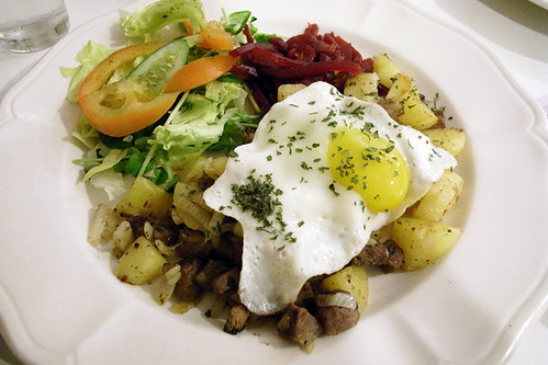
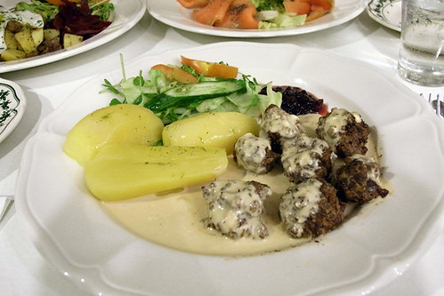
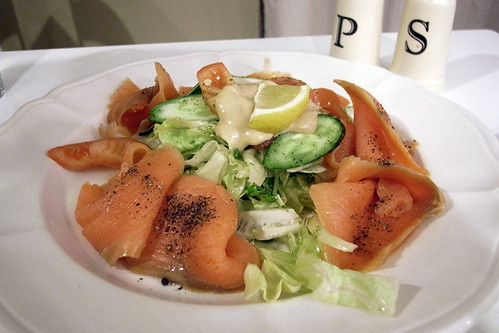
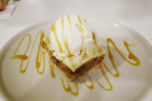
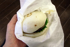
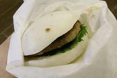
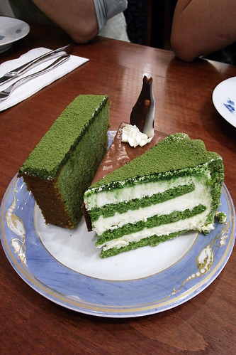
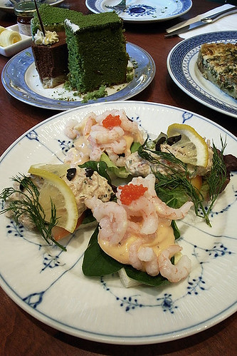
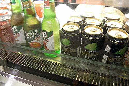
We ordered a smoked salmon platter to share and I had the meatballs, while JD had the beef hash. The food was simple and the flavours clean but comforting. I especially enjoyed the meatballs which seems to be handmade with a coarse ground meat which give them a nice meaty chew and grainy texture, compared to the mechanically made ones served at Ikea which tend to be smooth and homogeneous in texture. The meatball sauce was very heavy on the cream, which is never a bad thing, perfect for a small winter dinner (or for an imaginary small winter dinner). The meal ended with an apale crumble with vanilla ice cream. The crumble was unfortunately more gooey than crumbly, not exceedingly bad, perhaps pleasant in a made-by-your-mum way. Also available are cans of Swedish pear cider, but they are probably the non-alcoholic ones as the cafe is halal.

The nordic air in the place is undoubtable, the sense of communalism and inclusivity is can be felt in both its conception and service, it's like eating in somebody's home. Open till 11pm on most nights, the place is great for a long dinner after work, before heading off for shisha across the street.
fika 3
fika 2
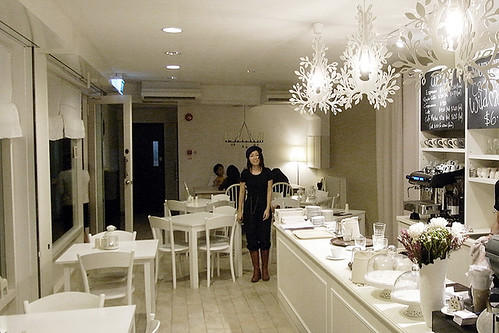
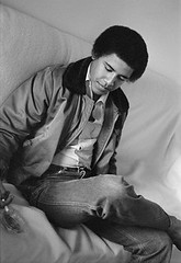
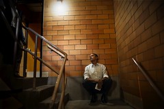
JD making an appearence.


Fika Swedish Cafe & Bistro
257 Beach Road/Arab Street

Saturday, September 26, 2009

r burger

r burger 2
r burger 3
r burger 4
R Burger has all the elements of a winner, its Japanese provenence, the play of a familiar food type- the burger, intersecting it with flavours and ingredients more often found in a Japanese restaurant than a diner; flavours that too have become familiar in many parts of the world but not in a burger. R Burger, is basically a Japanese take on the burger, an exoctizing or familiarizing, depending on where you see it from. You might imagine it to be another Mosburger but the concept and outcome is radically different.

In all the burgers at R Burger, the archtypal form of the burger can still be recognized, a sliced bun with a meat patty and some condiments sandwiched in between. But instead of a stack of toasted bread bun, sliced tomato, lettuce, patty and ketchup, the burger (well, the classic R burger which I had) is constructed with a branded steamed rice bun, beef patty, pickled daikon, a shiso leaf and accented with a soy-base sauce. The combination was quite intriguing and the Japanese flavour profile can definitely be discerned, plus anything made with shiso, I would almost certainly like it.

While I enjoyed the flavour combination conceptually, the burger falters with the choice of the unappetizing zombie beef patty which was dry and has very little flavour. add any kind of pleasant bite or texture to the burger as a whole. Also, its greyish hue did not help its cause.

I'll stick to Mosburger for now.
r burger 1

r burger
I_ON foodhall
basement 4

jumpsuit

kris van assche jumpsuit 1kris van assche jumpsuit 2
I am a fan of neither jumpsuits nor Kris van Assche, but this KvA ensemble that I came across in the Club21 autumn/winter09 mag might make me a convert. I don't know what it is with him, even with his (rare, some say never) good collections, there always seem to be something off, bad models or poor styling or something, just can't put a finger to it. The styling in the magazine editorial feels so much less contrived than the way it's style on the runway, with the jumpsuit in an earthy dark grey shade, fitted with a bit of slack, the folds of the fabric looking crisp, the cape worn unaffecttedly on the shoulders and the boots looking more flappy than poofy; the look seems almost credible for the streets, not looking as if you had just jumped out of bed in your long johns together with your blanket.

That said, you won't see me wearing any KvA just yet, or even a jumpsuit......mmmm..... perhaps I might give it a try if the one in the magazine shows up at 80% off at the store.

Thursday, September 24, 2009

barack obama in photos

in The Heroism of Vision, Susan Sontag's studies 'photographic seeing' - "the fact that photographs are evidence not only of what's there but of what an individual sees, not just a record but an evaluation of the world" - and how this evaluation may be distorted as it is communicated to the viewer.

obama lisa jack 01
obama lisa jack 02
obama lisa jack 05obama lisa jack 03obama lisa jack 04

and so a forgotten photoseries of a 20 year-old "Barry", who might otherwise be just another college student, becomes a humanising foil for the Barack Obama the world sees today. first run in Time magazine, this series by photographer Lisa Jack is a quiet, conversational set of photographs of a young man with 'a bomber jacket, flared jeans, a pack of cigarettes and a Panama hat he thought would look “cool"'. sitting down, lounging, hunched, cigarette smoke twirling upwards: a quiet world away from the upright, electric persona we saw in 2008.

obama callie shell 013obama callie shell 014
obama callie shell 017obama callie shell 031
obama callie shell 007obama callie shell 032

the series reminded me of another reportage that Time, incidentally, ran in the run-up to the elections, by Callie Shell. she traces the behind-the-scenes path of Obama during his campaign, ending with his victory speech at Grant Park. like in Jack's series, we see a human-sized Obama: asleep, doing pull-ups, reading the papers, and even see the bottom of his worn soles. but one is also aware of the remarkable distance between the two sets of photographs, even without the dates. Shell's work has a polished tone even as it looks under the carpet, whereas Jack's series sits casually, almost awkwardly.

perhaps Sontag is right, and no photograph can ever speak by itself. for every photo of Obama there are a host of pre-dispositions on the part of the photographer, and then the viewer. but i believe there are still some comparisons we can make, to some degree of usefulness, between the television image, the two reportages, and the man himself, whoever he is.

credits: Barack Obama: The Freshman, Lisa Jack;
Barack Obama: Road to the White House, Callie Shaw

less but better / undercover mens ss10

undercover ss10 1undercover ss10 2undercover ss10 9undercover ss10 4
undercover ss10 3undercover ss10 6undercover ss10 5undercover ss10 7
undercover ss10 10undercover ss10 8undercover ss10 13undercover ss10 12
undercover ss10 11undercover ss10 15undercover ss10 16undercover ss10 14

The Undercover ss10 collection is one that is easy to like. Taking inspiration from German industrial designer Dieter Rams, Jun Takahashi channels the functionalist spirit of Rams' design philosophy, sending down the runway a collection of highly wearable but not run-of-the-mill pieces. Easy pieces with clean structured lines executed in a palette of neutral shades, a spectrum of clinical white slowly diffusing into a dark midnight black. Many of the details on the garments take direct references to products designed by Rams; contrasting panels on jackets and burnt orange accents and laether straps are found on some garments while others feature perforation and label-like insets. Tech fabrics, as in many of his past collections, take centre stage. There is also a conscious play of volume, juxtaposing the hard, structured, pared down, sometimes body-obscuring lines of the jackets and outerwear, with tight body-conforming, speckled metallic leggings or billowy pieces done in soft flowy fabric. There were also quite a few printed camo looks in the collection which I felt look rather unfortunate. I have left thoseepictures out, though, I would give it a second look when they hit the racks; I might just change mind mind like I did for the ss09 outwear.

undercover ss10 others 3undercover ss10 others 4
undercover ss10 others 6undercover ss10 others 7

Named "Less but Better", which is the motto that Rams worked by, striving to making objects better, straightforward, easy to use and stripped of all superfluous elements. The pared down aesthetics and the clean lines of the collection bears a strong visual congruence with Rams' product designs. The collection is seemingly an attempt at melding industrial design with fashion design, manifesting Rams' aestheticized functionalism (as opposed to pure functionality) in the realm of fashion (as opposed to functional tech garments); but at the same time, it also begs the comparison between the two rather different disciplines. Industrial design, in Rams' case, puts more weight in the function and workings of the product, after which the aesthetics is applied to composing the functional parts. A beautiful product that does not work well is a poor design, form follows function if you will. On the other hand, in fashion design (specifically referring to the realm of seasonal high fashion in which Undercover exists), the function-aesthetics balance, more often than not, tips to the side of the latter. The intensity and potency of the functionalism found in industrial design is perhaps harder to achieve in fashion. An example would be the use of perforation in the collection, the perforated shirt and the triangular perforations of some of the outwear are less functionally informed than, say, the perforated circle on the shell of a Rams radio serving as the speaker. The perforations on the garments are more motif-like than anything else.

Disregarding the conceptual inconsistency (I was just being unnecessarily demenading), I do enjoy the collection and I think it will do well on the racks. It is a good mix of unfussy pieces that can easily be dressed up or down and will appeal to the young upmarket clientele and alos Undercover's strong streetwear fanbase.

The Undercover spring/summer 2010 was presented at the Pitti Uomo 76.

Saturday, September 19, 2009

iluma : crystal mesh


"By intention a complex and ambivalent impression. On one side there is the impression of an ultra large media screen, which is not yet fully there. It appears to be still deep frozen under a surface of ice, cracking and thawing. A herald of a fundamental change of architecture, which is about to transform from a static to a dynamic art."
---Realities:United

Filmed in March 2009, the video documents the first configuration and testing of the dynamic media facade of Iluma, the latest shopping mall in the Bugis area, designed by WOHA with the facade lighting created in collaboration with Realities:United. The animated lighting sequence, choreographed by Autokolor, as seen in the video (with music) is admittedly seductive, but at best a muted exclaimation when seen in real life. The snow flake-like tessellating geometric forms of the florurescent lighting fixtures that seemingly promises Christmas all year round are somewhat intriguing in detail if not bewildering, but ultimately gratuitous. Designed to inflict maximum visual punch with its formidable size and scalelessness, it is a spectacle masquerading as art. The media wall at Iluma is one which is a medium for nothing but itself, a statement of self indulgence and flamboyance without the contents to boot.

Architecturally, Iluma is a chop suey of Miralles curves in plaster, frute versions of HdeM's dimpled perforated panels ala De Young Museum, glued onto a Sauerbruch Hutton red barcode box. The tropical modernist roots of WOHA, though, can still be found in the oh-so familiar L-bar metal details and resort-like landscaping; some of the metal door details and sleek black steel wall panels inside are undeniably beautiful. Such quiet refinement is perhaps inconseqential to many people, who are (willingly) mesmerized by the mardi gras of ornamentation. Together with Wilkie Edge (just 2 blocks away), this two WOHA designed malls join the list of recent malls like Central and Orchard Central that are architecturally outlandish and overembellished. These new malls all brandish a misguided view (on the part of both the authorities and developers) that urban vibrancy can be achieved through the creation of the image of urban vitality without making much effort in the cultivation of the actual urban content, what I like to call neon urbanism. With their lastest mall projects, WOHA has definitely shown us that they have pretty much fallen off their neo-tropical-modernist edge, plunging into a baroque orgy of self indulgent pattern making and surface play.

WOHA /Realities:United /Autokolor

Thursday, September 17, 2009

royal copenhagen tea lounge

cphtealounge (1)cphtealounge (2)cphtealounge (4)
cphtealounge (3)cphtealounge (5)
Having frequently passed by the discreet entrance of the Royal Copenhagen Tea Lounge at the 2nd level of Takashimaya in the last 14 years, I have not once had the urge to go in, kind of like the guy you always see on the train to work in the morning but never talk to, just the cold glance of acknowledgement. It really looks like a pleasant place from the outside, but you don't really much of the place beyond the cake counter where the space turns a corner to the back of the Burberry store.

It was a random decision to meet a few friends at the Tea Lounge after lunch (yes, straight after!) one Saturday afternoon, a sudden impulse to visit this "new" old place, to find out what lingers beyond the cake counter. The space turned out much larger than what the small entrance suggested, stretching in almost 20m in with tables lined on both sides of the space, perhaps long and narrow are a better words to describe the space than large. The interior is tastefully decorated, furniture with clean lines and white washed walls with a few pieces of art work, it exudes what I call nordic underwhelmingness (pardon my gross cultural generalization, and also allow me t invoke the Swedish word lagom).

Though having previously lived in a couple of Nordic cities for some time, I have absolutely no conception of what a Nordic "tea" might entail. Only cardamom buns and skoleboller come to mind but both were not be found at the place, unfortunately. We ordered, to share among the four of us, 2 tea sets which included a few slices of cakes, scones and Danish jams, spinach quiche, tuna and cold shrimp open face sandwiches, coffee and tea. Save for the open-face sandwiches, the items sounded more English than Danish though I would say that any one of the items would likely be fairly common in the Nordic countries. Among the things we had, the green tea cake particularly stood out to me, the rich flavour of the green tea, moderately sweet with a slight bitterness encased within the slab of dense green foam, no gimmicks, simple but excellent.

The place started to fill up during mid afternoon and as I was enjoying my earl grey tea, I noticed the crowd was mostly female, many of the tai-tai variety. I suppose having scones with strawberry jam, sipping tea from fine china is not, by most standards, the most testosterone-laden activity.
cphtealounge

Royal Copenhagen Tea Lounge
Takashimaya
391 Orchard Road, Level 2