Wednesday, December 30, 2009

daniel svahn pallarna

daniel svahn pallarna

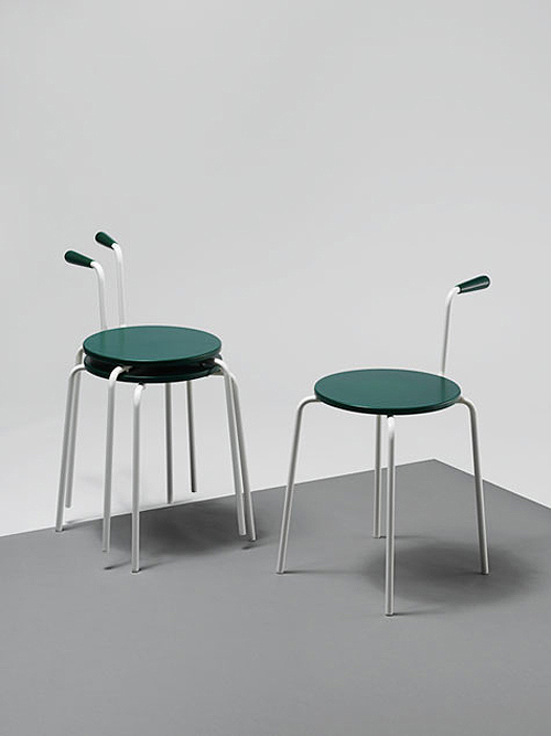
"Daniel Svahn brought the concept of Chinese Whispers to the designing of his Pallarna (Swedish for stools). He took an image of Jacobsen’s ‘Seven’ chair and wrote a description of it without explicitly saying it was a chair. Another designer then sketched a design based on his text. A third designer wrote a text based on that image which was passed to a fourth to draw it. ‘Each step created variations and produced a final design that I might not have come up with myself,’ says Svahn. ‘The shape took off based on different interpretations so it was an intensely shared process.’ "
wallpaper graduate directory 2010
It would be interesting if he had also made the chair that was sketched by the second designer and placed them along side the Jacobsen 7 series chair which was the starting point. The design process plays on the idea of multiple (mis)interpretation and using the limitations of text into an exploratory tool, which in itself is intriguing, but in this case, the execution might have been more provocative if the concept was pushed a little further by repeating the steps a few more times, resulting in a more drastic departure from the original, perhaps letting it transform into another type of furniture or even into something outside the realm of a functional object.

daniel svahn
wallpaper graduate directory

Tuesday, December 22, 2009

menya shinchan

menyashinchan3
Menya Shinchan is a small ramen house located at a discreet spot in a little yard off the main pedestrian street at Robertson Quay, a spot I always think of as the armpit of Robertson Quay or if I were to be asked for directions to the place, I would say it is "somewhere near the toilet" and people fairly familiar with the sanitary geography area would almost immediately understand. Personal hygiene aside, I have not noticed the shop until a friend pointed it out to me one evening on our way for some drinks (while waiting for another friend who was using the toilet! haha!).

The shop sits beside a Thai restaurant (which is pretty excellent by the way) facing the yard, its full glass shop windows plastered with homemade signs and menu board, modestly proud, like a small family business. The interior is a little sparse but warm, almost charming. The space is wide and shallow with the kitchen at the back, sceened with more homemade signs and short fabric curtains. Counter seating line the exterior side of the kitchen with stacks of bowls, utennsils and condiments placed in front of diners. Tables for 4 fill up the rest of the dining area, save for the cashier counter near the door. The mood is reminiscent of the cramped ramen shops in Tokyo but the scale is palatial in comparison, and perhaps, lacking little buzz of after-work chatter or the excitement of the cook flinging hot ramen into bowls of hot soup right in front of you.

I ordered the shoyu pork bone sinjiro ramen expecting a typical bowl of ramen, perhaps a slightly tweaked version with a signature twist or some secret stock. But it turned out to be a a bowl piled high with a heap of blanched cabbage and bean sprouts drizzled with a bit of soya sauce. The egg and chashu were lined at the side, leaning against the mountain of cabbage. My first thought was" where are the noodles?!", which prompted my next course of action which was to start excavating the mountain. Like a hidden pot of gold, the noodles were buried at the bottom, I almost had to overturn the pile of greens to find it. The noodles were not the typical ramen noodles but thicker and more chewy, similar to something one might find in prawn soup noodles or fishball noodles in Singapore. The shoyu pork bone stock was robust in flavour with a film of oil floating on top giving the stock a little aromatic boost. The cha-shu at the side was unimaginably tender, literally dissolving with the press of the tongue in your mouth. The egg, though, was somewhat disappointing with the yolk fully cooked. A well cooked liquid centre egg, to me, is essential to the ramen experience. The ramen was also served with chopped garlic which I had forgotten to add, as I dove straight into the noodles (or rather, trying to find the noodles).

This particular style of the ramen was not something I am familiar with. A little research revealed that this style is in fact a version of the well known Ramen Jiro of Tokyo. While quite a handful of franchise Ramen Jiro shops can be found in Tokyo, all of their lineage can be traced to the Mita Honten (三田本店) in Mita, catering to the hoards of hungry students from Keio University with their hearty portions. Sinjiro 新二郎 in fact means
new jiro, its provenence of the style undoubtable.

The serving portion at Menya Shinchan (as at Ramen Jiro) is, at the risk of sounding sexist, very manly, but if you happen not to have the appetite for a full porion of the sinjiro ramen, Menya Shinchan serves a smaller version called the
madame sinjiro ramen, for people with more petite stomachs.
menyashinchan5
menyashinchan4
menyashinchan2
menyashinchan1

menya shinchan
30, robertson quay
riverside view #01-05

Sunday, December 13, 2009

holl in herning

steven holl herning 1a
Lying on the flat landscape of Herning, is the recently completed Herning Center of the Arts designed by Steven Holl. Resembling a pile of white shirt sleeves, it forms a counterpoint to the old Angli shirt factory sitting across the street., which is shaped like a dark grey shirt collar. The "sleeves" are interwined and forms the roof of the building, draping over the spaces within, forming a convex underbelly that is reminiscent of Jørn Utzon's Bagsværd Church and the Kuwait National Assembly.

However, the most in triguing part of the building, for me, is the wrinkled concrete surface found on the exterior of the building. Created by inserting fabric tarps into the formwork in which the fresh concrete is poured - allowing the concrete to take the shape of the creases and folds created by the tarp, the wall yields a kind of softness that is hard to create using conventional casting techniques.The quality is fabric like and visually soft, uncharacteristic for concrete; the tactile nature of the wall begs the visitor to touch it, to verify its materiality. There is an element of chance involved in its creation; neither the builders nor the architects have total control of exactly what the surface would eventually look like till the formwork of the concrete has been removed. They can only set the condition in which the surface is formed, almost like playing a surrealist game.

More about the building here and here.
steven holl herning 4steven holl herning 3steven holl herning 5
steven holl herning 7
steven holl herning 6

Wednesday, December 9, 2009

some lang

langss03 blangss03 clangss03 fhl0304.10
hl0304 bhl0304 a

reminding myself how awesome pre-Theory Helmut Lang was (and still is), some detail pictures from his shows in 03 that I came across on while forum surfing. it is startling how little the design of the pieces have aged, if at all.

Friday, December 4, 2009

aesop store singapore

aesop_singapore (1)
aesop_singapore

"In our Singapore store, thirty kilometres of coconut husk string, a regional product, was used to construct a dynamic whole-ceiling light fixture. When combined en mass, the seemingly insignificant threads mesmerise and remind one of airline magazine flight maps."

“Geography, climate and light all inform which path we take with our design decisions. For Singapore, we referenced the humble ball of twine with which we wrap and detail our gift boxes. The entire store is framed with meticulously detailed grids that suspend twine from the ceiling. The idea is to work with a sombre material palette in an unexpected way. We’ve used coir matting as carpet and marine plywood to detail our storage units which conceal a palette of Corbusier-inspired coloured wall panels.”
Designed by Melbourne office March Studio, in collaboration with Aesop director, Dennis Paphitis, the new Aesop store in Singapore at Millenia Walk is a great departure from the typical cool and clinical Aesop store interiors. Applied across the whole ceiling, the dangling strings diffuses the light emitting from the naked bulbs nestled within, casting a warm glow onto the simple interior space. The deep fuzziness of the ceiling fixture visually lowers the height of the space, bringing it to a level that is more appropriate for the floor area, forming a flatter spatial proportion that is more pleasant and intimate. Maintenance issues aside, the result is decidedly modern and powerful for such a small space, creating a kind of visual tactility (or physical if you are tall enough) and restrained sensuality that you do not often find in many of the flamboyantly patterned architectural surfaces that are all the rage right now.

aesop_singapore (2)

Tuesday, December 1, 2009

underscore : the _ issue

underscore2
Local design collective, HJGHER, launches Underscore, an independent semi-regular publication with each issue based around a single thematic focus. With contributions from writers around the world (including our friend shan), the theme of the first issue circles around the idea of Honesty, Integrity, Quality and Authenticity. What underlies the whole project is the love of print and typography with great care taken in the layout, typeface (the one used for the titles was specially designed for the publication) and paper stock, as can be seen in the magazine launch exhibition at Asylum which displayed mock-ups, draft pages, thumbnails and other scraps describing the process of putting the first issue into print.

The vibe is vaguely monocle-esque with same attention to presentation and luscious tactile feel; the content is equally off-beat but lacking the unreal optimism of the Monocle spirit.

s$15 www.theissuemagazine.com

underscore3underscore4
underscore7
underscore6
underscore1
underscore5