Saturday, November 28, 2009
osvaldo
Entering the restaurant through the door which was once the main entry to the building facing the junction of Maxwell Road and Shenton Way, the whole restaurant comes into view. Seperated onto 2 split levels (probably pre-exisiting and not by design), the space is large with high ceiling but at the same time intimate and welcoming. Littled with Chef Osvaldo's collection anitque furniture, the decor is simple and rustic, if a little nonchalant and haphazard (in an endearing and homely way).
In between tending the kitchen, Chef Forlino can be seen going from table to table casually chatting with patrons, explaining the food and checking if everything is alright. As this was our first proper meal at the restaurant (I have been to the restaurant previously but only for a quick but excellent pasta during lunch time),we spoke to Chef Forlino who offered to arrange for an assortment of items for the table to share.
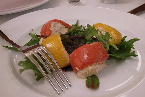
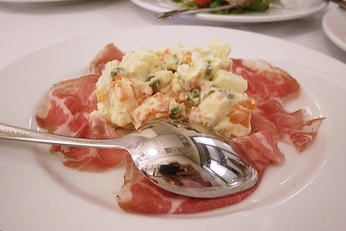
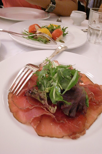
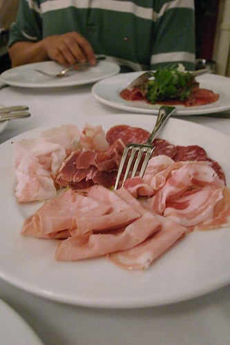
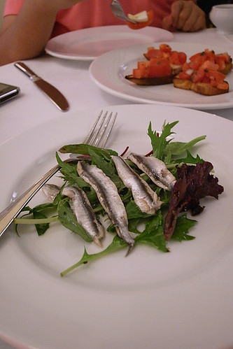
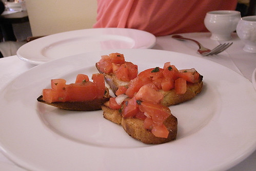
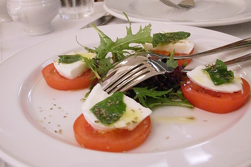
Having no idea which items we were going to be served, the meal began with a food train of antipasti. We were served a total of 7 antipasti which includes bell pappers stuff with tuna mayo, russian salad, bresaola, cold cuts platter, fresh anchovies, bruschetta and buffalo mozarrella.
The anti pasti were mostly excellent, perhaps with the exception of the russian salad which was a little like what you might get as part of lunch in some cafeteria. The bruschetta was particularly outstanding, the sweetness of the diced tomato highlighted with olive oil and basil. The waiter, when he served the Bruschetta, quipped, "can make at home!". The simplest food allows the natural falvour of the ingredients to be expressed but also requires the use of good ingredients as the lack of flavour cannot be masked by seasoning.
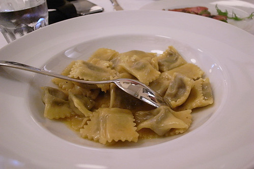
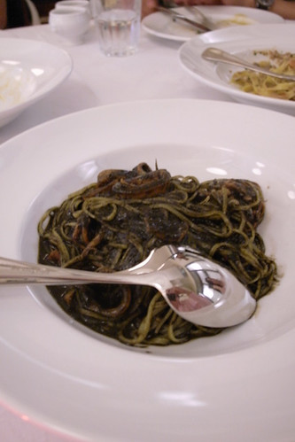
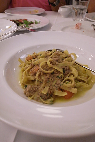
After the antipasti, we were served 3 pastas to be shared. Firstly, it was the Piemonte agnolotti with veal shank sauce. Stuffed with bacon, the pillows of agnolotti were bursting with the smoky goodness of bacon, which was complemented by the lightness of the veal sauce. The second one was the home made tajarin with squid ink sauce. I usually do not order squid ink pasta but I rather enjoyed this one. The last and my favorite one was the tagliatelle with wild boar ragout. This dish is simply tagliatelle tossed with minced pork in broth, basically an Italian bak chor mee. I am partial to flat pastas but the winner in this dish for me is the pork ragout which was so full of flavour. All the pastas were perfectly cooked, firm with a bit of bite.
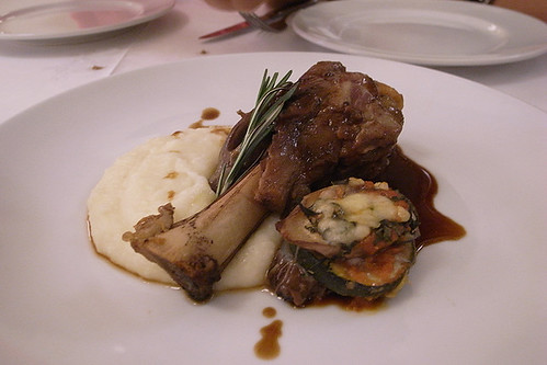
Being rather gluttonous that day, we ordered the lamb shank which was recommended by the waiter who had served us earlier. The meat on the lamb shank, together with the gelatinous tissue around the joint, slid off the bone with a slight pull of the fork, tender and juicy (melt-in-your-mouth, to use the food blogger cliche), with the sprig of rosemary scenting every bite.
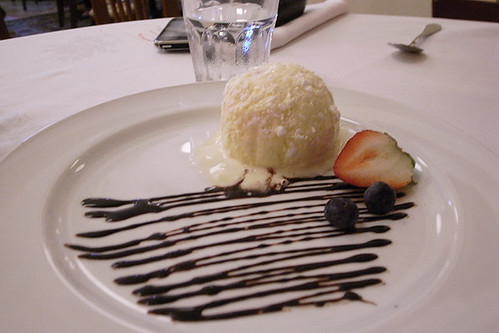
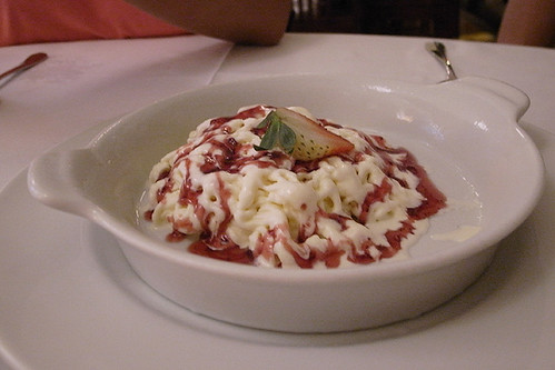
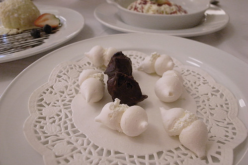
We rounded off the meal with a trio of desserts, which perhaps were rather disappointing. The more interesting one was the ice cream spaghetti which was strings of vanilla ice cream served with strawberry syrup. Someone commented it tasted like Wall's ice cream in a good way, but I found the sweetness rather flat. My favorite was unexpectedly the meringue sandwich with just a dollop of cream in the centre, creating a nice contrast in texture and sweetness.
Using locally sourced fresh ingredients and from the Forlino family farm in Italy, Osvaldo serves up uncomplicated food that tingles the tastebuds without try too hard. There is an inherent honesty that permeates beyond the food into every element of the restaurant, from the casual atmosphere, the charming but not overthought decor and the professional service. The outstanding front of house staff played a particularly important part in crafting the experience at Osvaldo. Ample knowledge of the food served and sincere recommendations, coupled friendly banter, are not something that is easy to find in Singapore restaurants; it's like being hosted in a friend's home. The idea of a cosy neighbourhood Italian restuarant serving home style Italian food is perhaps still a rather foreign concept in Singapore, but Osvaldo has scored very high marks in my books.
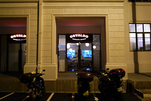
Osvaldo
Unit 03, 01/F
Maxwell Chambers
32 Maxwell Road
Monday, November 23, 2009
the burj
A view from the highest built point in the world, the tip of the spire of the Burj Dubai. The surrounding land, the new "downtown Dubai", acquires a Google Earth like quality. The city is seen from a god-like perspective, detached yet with startling but false sense of clarity. The city can be observed in its entirety but with poor definition. The scene is static, like a photograph frozen in time, any sense of life is projected, imagined. The flatness of the land emphasized, devoid of natural terrain; the surrounding buildings dwarfed and distant, viewed like a Sketchup model plonked onto google earth, seen with an unnatral and unlikely angle. The immensity of the building has pushed it far beyond the threshold of being a tightly interwoven part of the city. To manyit will be the new icon of Dubai, one of pure bigness. Like a rupture in the urban fabric, the burj is a city in its own and on its own, one can only look out from it or look at it.
Friday, November 20, 2009
braided sweater 1983
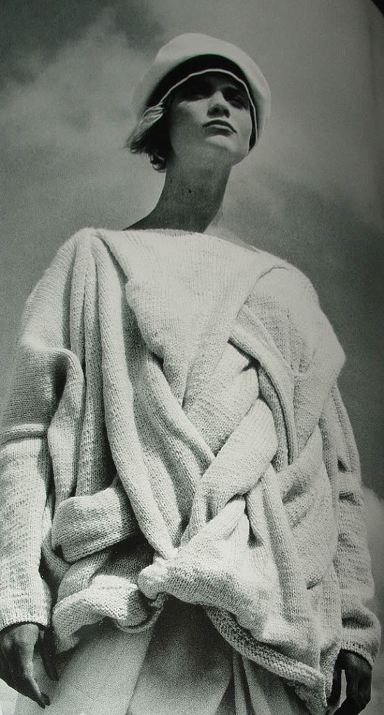
This braided knit sweater would not look out of place if it appeared on the runway today for the current fall/winter collection or even the next fall/winter collection. Looking like a cross between SNS Herning and Fabric Interseasons, it is actually from the comme des garcons fall/winter 1983 collection, looking as relevant (perhaps irreverent) today as it was more than 25 years ago. There is a sense of timelessness, but not of the kind one would normally associate with classic lines and simplicity, and being able to fall within the narrow and constantly shifting bounds of social and aesthetic conventions over time. Timelessness, in this case, is achieved by operating at the margins of or beyond these conventions, outside the realm of trends (but I must caution that there is a fine line between this and being purely wilful and irrelevant). The clutch of simplicty is shrugged off and the garment, rich in expression but decidedly undateable, bears the ability, and indeed demands, to be revisited time and again.
Sunday, November 15, 2009
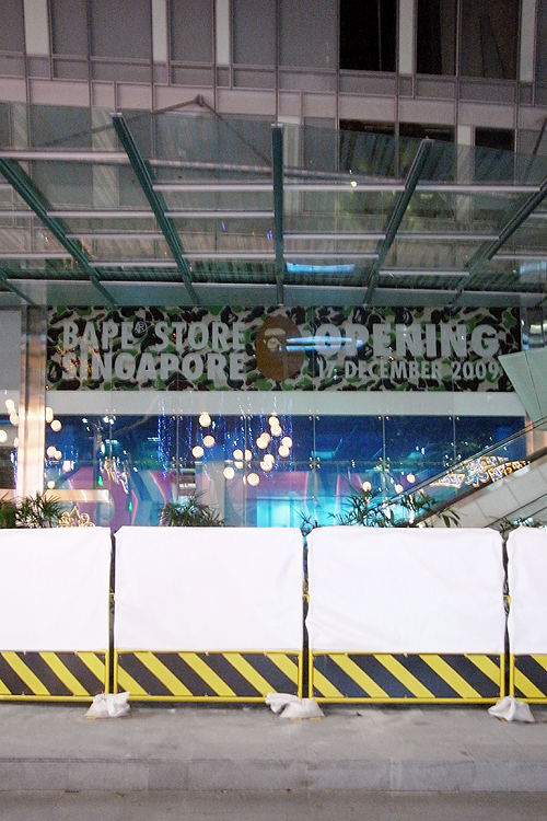
bape singapore
Had a little WTF moment when I saw this while walking down Orchard Road last night. This impending arrival of A Bathing Ape in Singapore has taken me a little by surprise, having heard no news about its opening before chancing upon it (I pride myself on being updated with the local retail scene), and the choice of the location in a shopping arcade along a major shopping street. The popularity of Bape has waned considerably since its height during the early 2000s, especially in Japan where it no longer has the same cred nor mystique as it once had; and it is making moves into markets where there is still a somewhat behind-the-curve following.
While I have no interest in the products nor do I associate with the culture surrounding the brand, I do enjoy, in a detached way, the interiors of the various A Bathing Ape stores designed by Wonderwall which I assume will be doing the Singapore store too.
Further down the road, a uniqlo megastore will open at 313somerset in a couple of weeks, which I am also hoping to be designed by Wonderwall who has done the New York flagship and the london Oxford Street stores.
Sunday, November 8, 2009
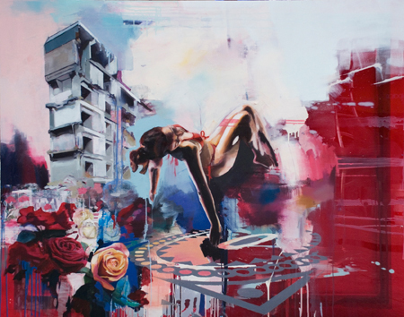
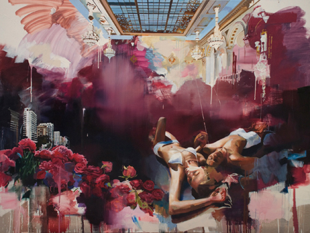
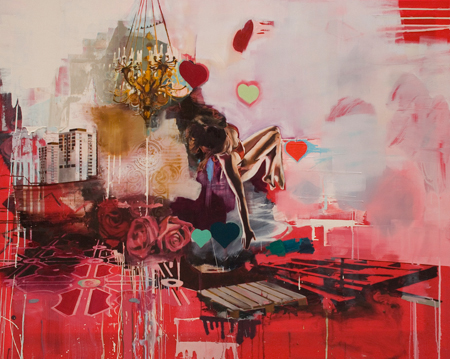
chloe early: clouded apollo
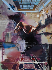
a riveting mashup of images and textures, Chloe Early's latest gallery juxtaposes urban housing blocks, tanks, and bodies sprawled out. her work on perspex is particularly compelling, introducing an element of translucency to each piece, a texture she exploits along with her palette of rough paint scrapings and drips. the aluminium pieces were slightly less convincing, losing the tight mesh of narrative.
i especially liked the printed urban landscape cutting into the painted space - the stark, looming blocks sticking through. there were prints for sale as well, also with the same urban motifs, but they felt different...
image on the right is a work-in-progress of the piece above it.
'Clouded Apollo' at the StolenSpace gallery,
Nov 5 - 29
Friday, November 6, 2009
comme des garcons x beatles
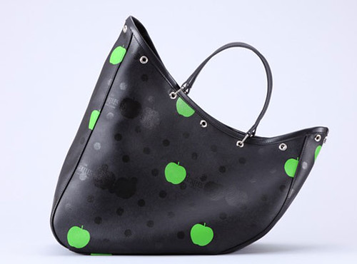
Two heads are better than one, and at Comme des Garcons, two brands, it seems, sell better than one. No strangers to collaborations, co-branded temporary lines have become the mainstay of the CdG family.While I have enjoyed and have been surprised by many of their past collaborations, even more leave me cold and thinking it is some sort of souless money making scam, an evil necessary only to keep the mainlines running. But recent news of CdG's collaboration on a line of bags and tees with the Beatles left me puzzled. I am immediately reminded of the Rolling Stones collection of the Homme Plus ss06 collection and the earlier Pink Panther collection (currently being reissued in the Home Plus Evergreen line), both of which were full collections with the benefit of having classic comme construction as a foundation and a breadth of pieces“For Rei Kawakubo’s hotly anticipated collaboration with The Beatles, the apple didn’t fall far from the tree. In fact, the logo of Apple Corps Ltd. — the London-based company that manages the legacy and musical catalogue of the British band — sits next to Kawakubo’s signature polkadots on a range of travel bags, the core of the collection, along with shirts and T-shirts.
Priced from around $115 for a T-shirt up to $860 for the most expensive bag, The Beatles/Comme des Garçons label is to launch Nov. 20 in Tokyo at the Trading Museum, a new Comme store concept in the Gyre building. Dover Street Market, Kawakubo’s multibrand emporium in London, is to host the British launch on Nov. 27, with a further commercial rollout planned for 2010.” WWD
The Beatles collaboration, as a line of only bags and tees sounds like something produced just to make money with little work involved except to tack on logoes onto a rather banal product that had already been designed. Having seen this lone picture of the outcome of the collaboration, I am tempted to think it might be something a little more than a just a blatant merchandising venture, but my skeptics's hat refuses to come off my head.
Rei, Rei, Rei..... when will you stop.
Tuesday, November 3, 2009
lindsey adelman bubbles
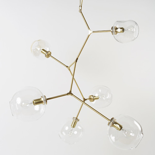
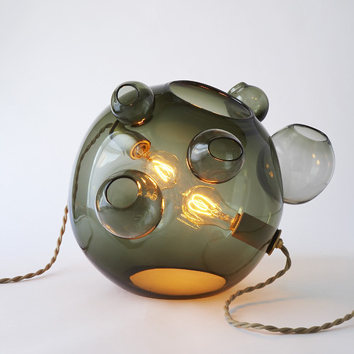
Lindsey Adelman's lighting fixtures are like wild mechanical plants, sprouting from a ceiling or from the floor on a stem, with pivoting stainless steel arms, sometimes brass, branching off like in a classical molecular structure. The branches terminate with glass buds at the ends, each housing a naked electric bulb which feed off the energy coursing through the wires embedded within the branches and stem, blooming in a display of anti-photosynthesis at the flick of a switch. Sometimes, the light is melon-like, sitting freely on the floor with vines sprawling across it, alwasy ready t be plucked and transplanted to another location, perhaps a tabletop.
There is a quiet botanical beauty despite the use of cold inorganic materials. Each fixture is made to order and prices will ensure the farmer is well fed. The description of the 3-globe with naked bulb reads,"...add $1600 for each globe and $400 for each socket without glass."
see more of her work here.