Friday, October 30, 2009

opening ceremony x billy kirk

billy kirk opening ceremony 1billy kirk opening ceremony 4
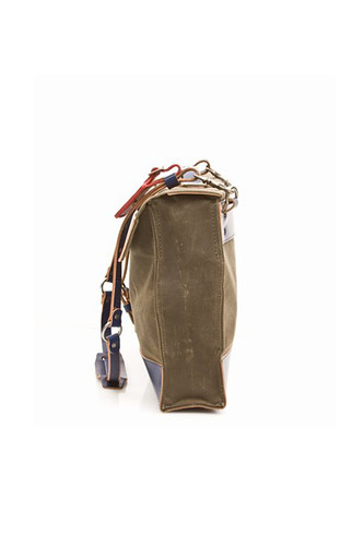
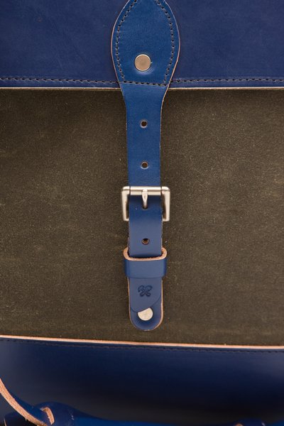
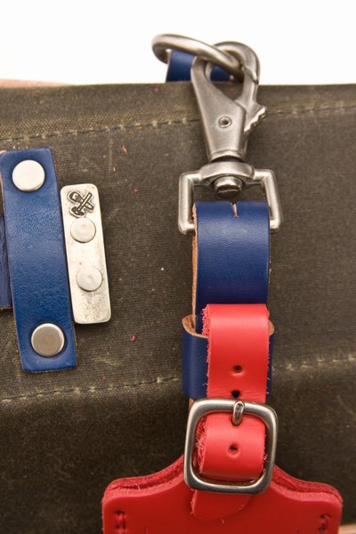
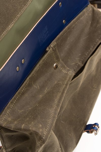
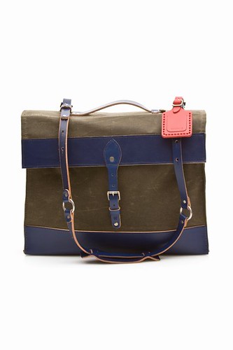
Opening Ceremony collaborates with Billykirk to create this quirky confection of waxed canvas and leather. Labelled as a laptop satchel, the simple rectangular shape of the bag is also suitable for use as a work or school bag. The main body is made from an earthy dark olive colour waxed canvas with the bottom laid with leather. The design is highly practical with a durable leather shoulder strap, handle and a leather top flap with an attached buckle. The design might be simple and practical but the coloured leather components give it sort of a washed-out-de-stij vibe, melding classic leathercraft with the sembelance of modernist art.

available here
billy kirk opening ceremony 5billy kirk opening ceremony 6billy kirk opening ceremony 8

Monday, October 26, 2009

erwin hauer : continua

erwinhauer (3)
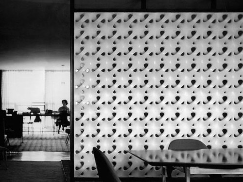
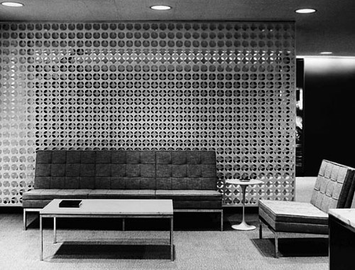
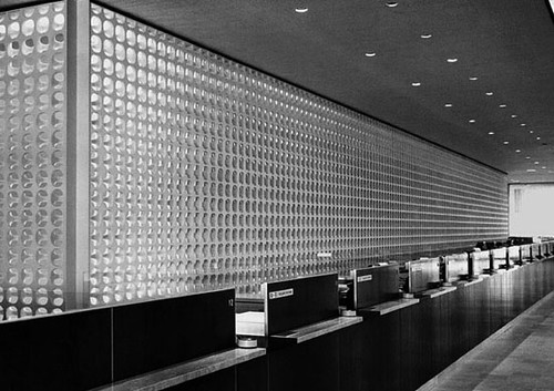
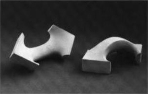
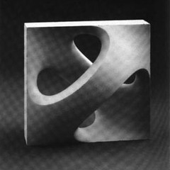
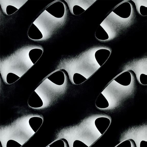
The Continua screens of Erwin Hauer are at once, skin and space, liquid and stone. The anitclastic surface curves and weaves into itself in periodic rhythm, infinitely expandable through modular addition. Though earlier versions had to be put together from indivdual handle-like components, advancement in casting technology allowed single, and later, multiple modules to be cast in a single piece. The graphic quality of the screen is striking, especially in a large expanse, where it visually feels like a punctuated geometric sheet. Up close, the sculptural and spatial qualities become apparent, the curvature morphs in 3 dimensions, concave becoming convex, forming a cavity in between through which light, air and space filters through. The screen casts a shadow within itself through its own depth forming an interplay of light and shade; its curved surface reflects incidental light in multiple directions, casting a diffused, ethereal glow onto itself.

Some words from Hauer about his Continua screens here.
erwinhauer (4)
erwinhauer (2)
hauer design 1 1hauer design 1 2erwinhauer (5)

Friday, October 23, 2009

taste paradise : century egg lime sorbet

taste paradise 1
Once in a while, you might come across something so wacky and ridiculous but ends up changing your mind about something. There are quite a number of food that I would actively avoid when I eat and century egg is one of them. I don't find the look of century egg unpleasant as much as I dislike the taste. Recently, I had a little appetizer at Taste Paradise at i_on that made me rethink my aversion to century egg.

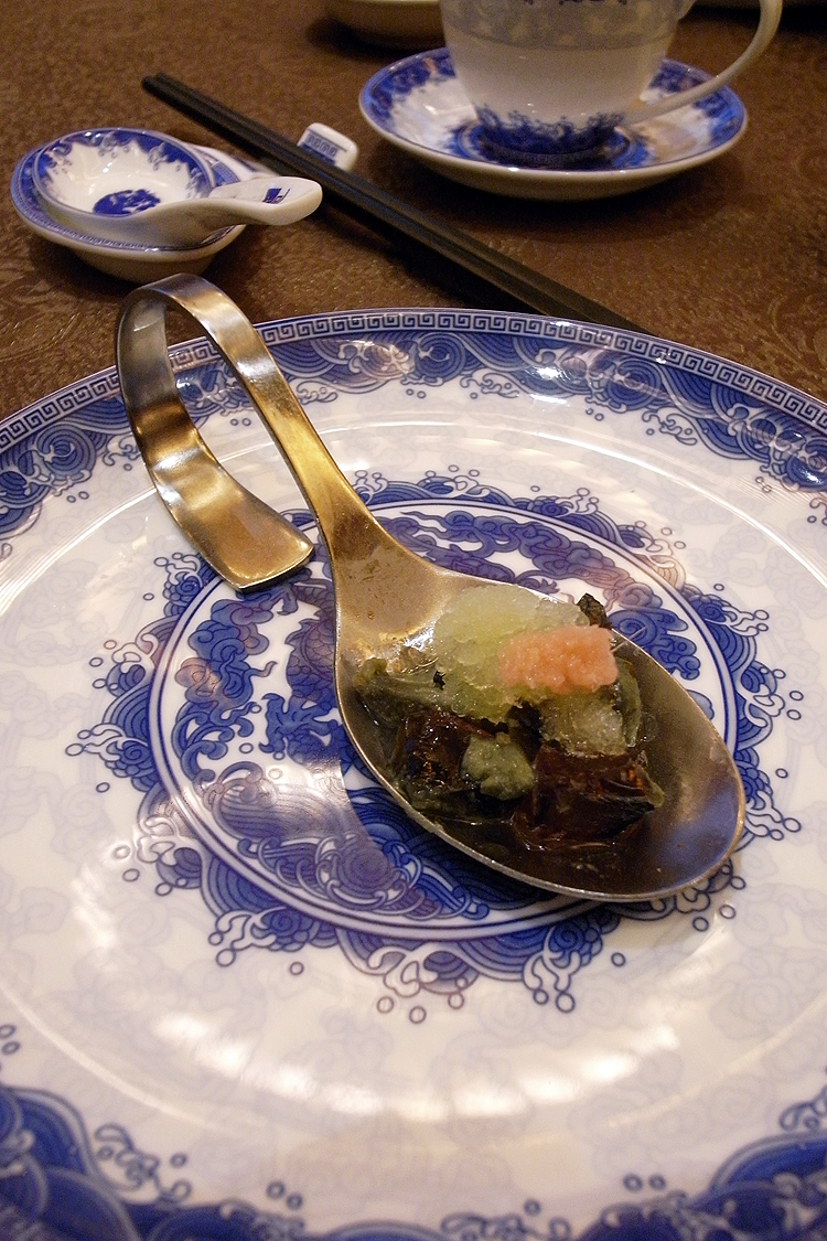
This appetizer daringly combines coarsely chopped century egg with lime sorbet and topped with a small portion of finely chopped pink Japanese pickled ginger. The combination is served cold in an amuse bouche size on a margiela-esque bent . The components are broken down but not mixed, gelatinous chunks of the dark brown century egg "white" can still be discerned, juxtaposed with more cheery shade of the pale green lime sorbet and candy pink of the pickled ginger. The result is a petite but intriguing mouthful that is layered in both texture and flavour. The lime sorbet masks the flavour in the century egg that I find quite unpleasant but leaves a clean but strong eggy end note after the citrusy perk from the sorbet subsides. The pickled ginger forms an underlying flavour which pulls the whole thing together. The use of Japanese pickled ginger is also a twist on how century egg is traditionally eaten with Chinese pickled ginger.

While I still do not like century egg on it's own after having this, but I do know now that it is not entirely unpleasant and can, in the right hands, be somewhat enjoyable.


taste paradise
2 orchard turn
i_on orchard

#04-07

Sunday, October 18, 2009

le bistrot

le bistrot 6
It's been a long time since I've visted Le Bistrot. The last time I went was some years ago when they were still operating out of their original Joo Chiat shop, a small cosy corner at the ground floor of an apartment building with, maybe, 10-15 tables and one person running the house, in addition to the lone chef at the back. The fare was straightforward, bistro staples like steak and onion soup. One of my favorite was their crab salad, freshly deshelled blue crab mixed with a little mayonaisse and a light dash of lemon juice, wonderful flavour with no gimmicks. The decor was equally unpretentious.

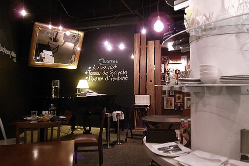
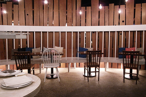
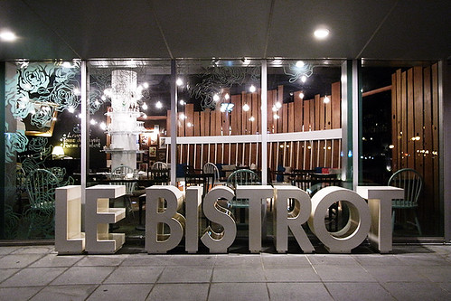
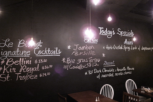
Move forward a couple of years, they are now at Stadium Cove, a cluster of restaurant at the bottom of the Singapore Indoor Stadium near the Kallang Basin. The space is visibly bigger and more "designed" than the original. Intentionally mismatched country style chairs arranged around wooden tables, a partition of unevenly cut timber planks divide the space into 2, the special menu chalked onto the blackboard wall, visible as the diner is led into the main dining area. The space is lit by an array of naked bulbs. The vibe is sort of a hip modern-rustic, the ambience is still casual but more self-consciously so. There were more wait staff managing the ful house, looking more frazzled and a little less personal then I remembered.
le bistrot 1le bistrot 2
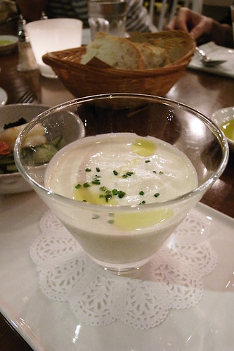
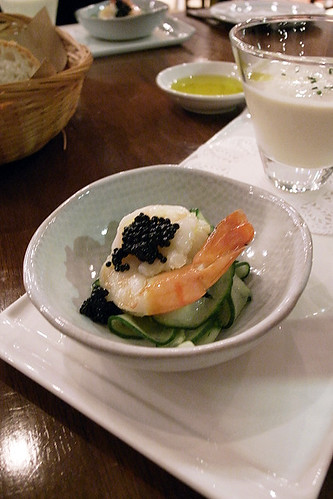
I started the meal with the vichyssoise glacée which was a chilled leek and potato soup paired with a cold Pernod marinated tiger prawn with avruga caviar on a bed of telegraphic cucumber. The chilled soup which came in a small glass was light and refreshing, thick but not heavy, though the flavour veered towards the bland side and the profile was somewhat monotonous. The Pernod marinated tiger prawn provided a little perk of flavour with the Pernod seeping into the cool telesgraphic cucmber below. You might ask what is a telegraphic cucmber and I honestly admit that I had not idea and had ordered this partly because I was curious about it. The cucmber came in a single long coil like a telephone wire and I, at that point, thought telegraphic refers to the cut of the cucmber but a little research on google some time later revealed that telegraphic cucmber is actually a variety of cucumber which is characteristically long and thin with a hook at the end. The coil cut cucumber was a fun way to eat cucumber nevertheless.

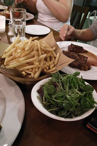
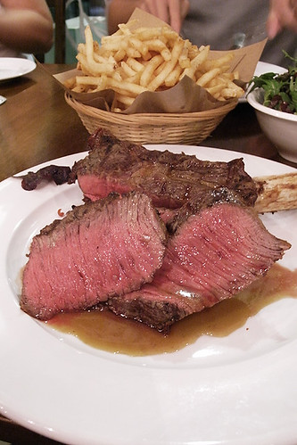
For my main, I shared a cote de boeuf with a friend. A cote de boeuf is basically a rib steak that comes with a single rib bone, one serving size is usually big enough for 2 persons. We had initially wanted it done medium rare but was advised that due to the thickness of the steak, the steak would have reached medium doneness by the time the centre has been properly cooked. We agreed with recommendation with the implicit idea that it was the best way for the steak to be cooked. The steak arrived already sliced portioned into 2 plates, the centre was pink and moist and a pool of jus has already dripped off the sliced steak. The sight was quite tantalizing, the steak looking more pink and moist then What I had expected. We tucked in striaghtaway (well, after taking photos). The steak was wonderful, well seasoned and perfectly cooked, every part of it was moist and bursting with beautiful flavour. The steak also came with a big basket of aioli fries and mesclun salad at the side which were quite enjoyable in their own right but totally overshadowed by the steak.

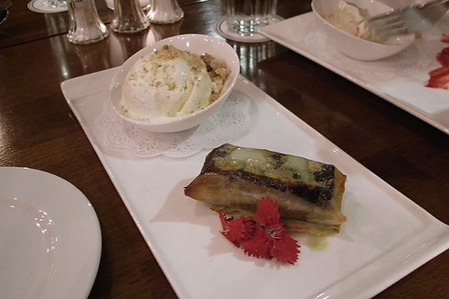
Already quite full from the steak, I shared a dessert with a few others. We ordered the pastilla, which was a dark chcoclate pastachio ganache wrapped in filo pastry with a scoop of vanilla ice cream at the side. The ganache was nice and rich and the basil oil drizzled onto the pastry provided a pleasant contrasting note, though the dessert as a whole, was not terribly exciting and the plating felt a little half hearted.
le bistrot 3ale bistrot 4
le bistrot 5a
Since starting at their Joo Chiat shop and now at Stadium Cove, Le Bistrot has been operating with a prixe fixe menu, fixed prices for either a 2 or 3 course meal. However , the prixe fixe system at Le Bistrot is perhaps increasingly more theory than practice as many items on the menu carry with them a surcharge on top of the prixe fixe, meaning the the cost of your meal varies depending on the items you choose. The surcharge is usuallyaround$10 but it is still fairly significant considering the 3 course prixe fixe is $60 and the possibility of multiple surcharges for different courses.

Prices aside, Le Bistrot serves one of the best steak I've tasted in Singapore, so good that it makes the the other non-steak courses on their menu seem mediocre. However, their epicural aspirations can definitely be felt on their current menu which has gotten more elaborate compared to their one they used to have at Joo Chiat. Their website says they are now a "bistronomique", a gastronomic bistro bringing "a new twist on the traditional French bistro" through the "creative yet idiomatic use of classic techniques and traditional ingredients to gastronomic ends". I'm all for culinary experimentation and creativity, but I hope that they do not forget the roots of the restaurant as a simple down-to-earth bistro. As long as they continue to serve up a mean slab of steak, I will be a happy return customer.
le bistrot 7le bistrot 8
le bistrot 9

le bistrot
2 stadium walk
#01-03, singapore indoor stadium
Friday, October 16, 2009

patrik ervell SS10

patrik ervell ss2010 1patrik ervell ss2010 4patrik ervell ss2010 3
patrik ervell ss2010 9patrik ervell ss2010 2patrik ervell ss2010 8
patrik ervell ss2010 5patrik ervell ss2010 7patrik ervell ss2010 6

the highlight of this show, for me, was Ervell's oxidised metal fabrics that he sent down the runway in shirts, suiting and harringtons. his work is often placed into a bracket, with words like 'minimal' and 'modern american' thrown about because of his consistent visual motifs of club collars, functional outerwear, denim and his pastel-driven colour palette. however, a sample shirt i found sometime last year made of cotton interwoven with metal filament really put a new light on his work. his collections are often as much an experiment with fabrics as well as visual references, apparent in pieces like his jackets in the gold foil polyurethane found on emergency blankets, to his faux-shearling trims woven from sheep's hair, something only previously used on luxury teddy bears, both from FW09. someone on superfuture made the reference to Helmut Lang in his cerebral approach to his collections, which is a comparison at least worth considering...

all these influences are evident in this collection, one of his more overt in the last few seasons. very much keen to handle the pieces when they drop at DSM in spring.

Wednesday, October 14, 2009

SANAA nextmaruni chair

sanaa nextmaruni 3
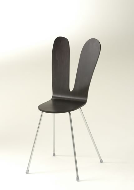
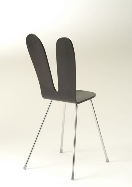
You might recognize the "rabbit" chair from photos of projects by SANAA (the collaborative practice of Kazuyo Sejima and Ryue Nishizawa), and it is likely that you have last seen it at the most recent Serpentine Pavilion which they designed. The chair, also designed by SANAA, is part of the Nextmaruni range of chairs by the Hiroshima based furniture company Maruni Wood Industries, in which renown designers are invited to design production pieces for the line. Designed in the tradition of Arne Jacobsen's series 7 chairs, the "rabbit" chair is made up of a steam bent plywood shell set onto a stainless steel leg frame. The plywood shell is spliced halfway in the middle, with the shape of the backrest looking like a pair of rabbit ears, perhaps more whimsical and easily liked than a minimalist white SANAA building.The articulation also serves an ergonomic function, diverting the pressure on the back of the a person to the side, leaving the spine free from any contact with a hard surface Wouldn't mind getting one of these for my room as a companion to the Chair_One I'm using now. Unfortunately, stockists outside of Japan are scarce and I'm too cheap to pay for shipping. And at ¥30000 each, the the chair is not particularly easy on the pocket, so for now, it'll just remain on my to-buy list.
sanaa nextmaruni 1sanaa nextmaruni 2

Sunday, October 11, 2009

bless no.39 heart ringers

The best way to appreciate a Bless collection is not to attempt explaining or critiquing it. Just enjoy the presentation and looks in all it's humour and kookiness, try on a few pieces if you are near a brick and mortar stockist.

bless no.39 looks

Saturday, October 10, 2009

hemeroscopium house
hemeroscopium 3b
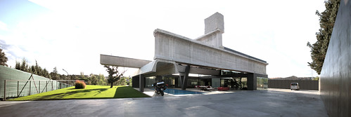
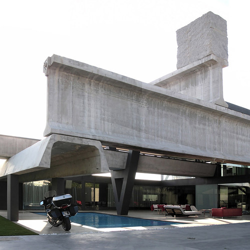
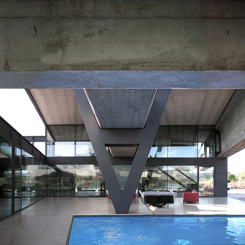
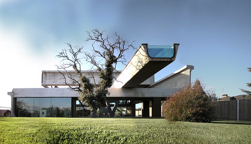
The Hemeroscopium House in Las Rozas, Madrid looks like a reincarnation of Mies' Farnsworth House in the form of a freeway interchange The space is defined by the structure, but not with the order, clarity and stability of Farnsworth House, but with a seemingly free form and visually unstable collage of a variety of exaggerated infrastructure scale component. A floor height steel girder joined to an enormous concrete I-section, stacked onto an inverted concrete channel. An inverted-V structure extends from the ground to suport the lap pool, itself a structural concrete channel closed at the ends with glass to form the water container, which cantilevers over the front yard. Beginning at with a mother beam at the bottom, the helical ensemble of oversized structures ends with a solid block of granite at the top, forming a counterweight to the delicate equilibrium of force and gravity. The result is sublime, as if the structures were caught in state of dynamic movement and frozen in time, the space observed in its precarious existence, formed only in this temporal standstill, willed by forces unknown. The lightness and openess of the space is emphasized by, if not a consequence of, the heaviness of the structures. The only wall infill material is glass, a material that denies it very own existence. The landscape is at once, allowed to flow into the domestic space and seperate from it.
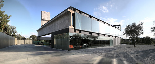
The house is an exercise in reconsidering the conventional tripartite notion of a house, floor, wall and roof; it also subverts modernist ideas of structural clarity and stability and of the clear delineation between structure and infill. It does so not with the pastiche of postmodernist architecture, nor skirts the discourse with organic forms or regressive nostalgia. It is essentially the same as Farnsworth House, a domestic space defined by pure structure with unobstructed connection to the landscape. It is however, a grostesque version (in a Bakhtin-Rabalaian way), a satire, but no less beautiful.
hemeroscopium 4bhemeroscopium 2
hemeroscopium 1
hemeroscopiu6

architect/ensamble studio

Tuesday, October 6, 2009

TWG tea salon

twg1
Teas are the new wines without the crazy sommelier talk.

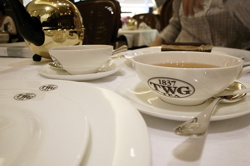
After a long wait, the TWG Tea Salon has finally opened at i_on a week ago. This is the first branch of the, still little known, tea salon (not including the 2 retail corners they currently run at Takashimaya and Changi Airport), operating in a more shopper-friendly location at Orchard and longer opening hours compard to the original TWG tea salon at Republic Plaza, which only opens on weekdays till early evening. With more than 20types of darjeeling tea alone, together with numerous other teas and tea blends that makes up the staggering 6 page long tea list, they are people genuinely interested in teas. Being one of the few shops at i_on that I was eagerly awaiting, I dropped by on opening day, initially only wanting to take a look at the shop, but it eventually became an extremely late pre-dinner tea session with 3 friends who were quite the tea afficionados.

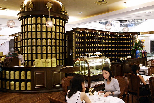
Taking up a central space among the shops on level 2, TWG adds a much needed buzz to the under-patronized upper levels of the mall. Enclosed by a transparent glass, the shop is made up of 2 parts, the first is a tea shop, selling loose tea leaves, house blends and smal pastries and macarons off the counter; the other portion is the sit-down tea salon serving the full range of teas and an all-day dining menu. The space is dominated by a wall of niches behind the counter in which a matrix of big yellow tins filled with tea leaves from around the world are displayed. Turning the corner into the tea salon, the niches become smaller, holding tea leaves meant to be used inhouse. An extended sliding shelf unit glides along the wall as tea leaves are taken out to be brewed at the counter. The vibe of the shop is one of an old Parisian tea shop, with deep brown timber panels accented with gold paint, polished gold frames holding up the glass windows which one might very well imagine to look into a Parisian arcade; a pair of (obviously unecessary) electrical bulbs light the sign board at the entrance, intentionally made to flicker as if tey were gas lamps from the late 1800s. The tea salon is small, perhaps seats only 25 people, on wicker chairs around square tables laid with jacquard tablecloth and folded napkins with the TWG logo on it. The metal utensils, too, are logo-ed.

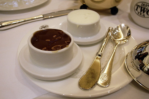
With the full intention to have dinner later, and adnittedly, quite skeptical of the quality of the kitchen on the first day, we only had tea and some pastries. I had the Smoky Earl Grey, which I was told was a lapsang souchong and eatrl grey blend. Tea purists might find such a blend (in fact, any blending and flavouring) a ?? adulteration of tea, but i really have no objections to tea blends, as long as the inherent flavour and aroma is not overwhelmed or desroyed by the additives. And with two of my favorite tea types in one, I was intrigued. The tea arrived in a big tea pot encased in a polished gold spherical tea cosy,holding enough tea to last quite a few cups. I had imagined the tea to have a more dominant lapsang note, and indeed when the tea was poured into the tea cup, the lapsang note was uverwhelming. But with a sip, the smoky pine notes of the lapsang gives way to the earl grey notes which become more apparent on the palate. The aromatic flip-flop was rather interesting, though I would say the combination is not 100% synergistic, with the constituents still clearly distinguishable.
twg7
twg6twg5
twg4twg 8
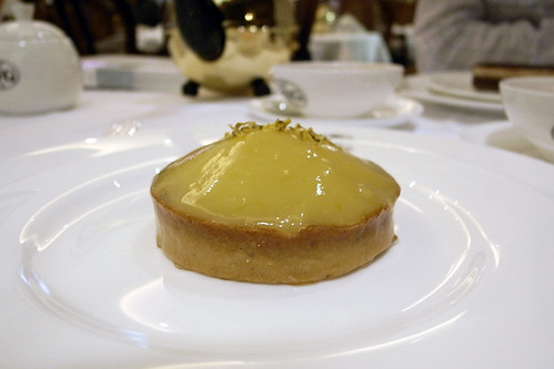
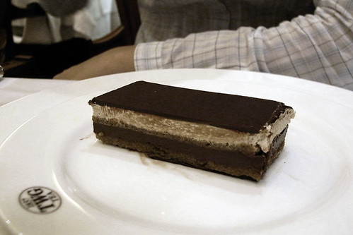
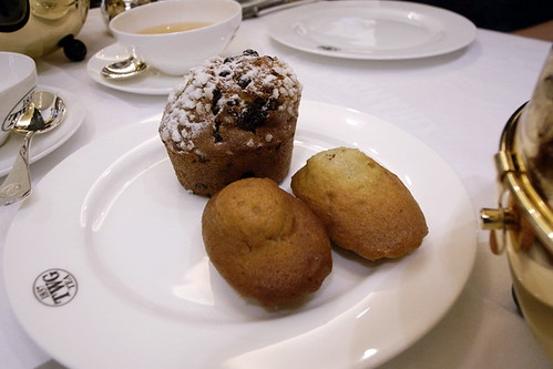
We also had a few pastries to go with the teas. I had the lemon tart which was a refreshingly light, with a sweet and citrusy lemon curd on a crumbly almond tart base. My tea mates ordered the Opera cake, and also a muffin and a couple of madeleines which came with cream and 2 types of tea jelly. Though more suited for scones, the tea jellys were truely delicious. Chilled, gelatinous and bursting with the fragrant sweetness of the infused teas (we had rooiboos and sakura tea jellies), the jellies dissolve immediately in your mouth and are good eaten on their own.

I enjoy teas a lot, though I am perhaps not as educated about teas as much as I would like to or should be. Looking at the long queue when I walked past the following saturday, I think TWG will be around for quite a bit and I forsee many more future visits. And with the i_on shop, TWG have just opened up a niche that is currently missing in the local food scene, a recognizable and legit tea shop run by knowledgable people selling an unparalled variety of good quality teas.
twg2

Sunday, October 4, 2009

what would margiela do?

margiela book

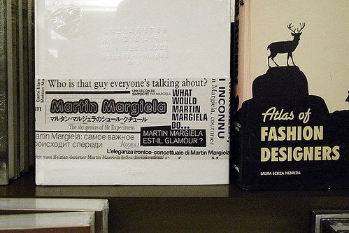
What would Martin Margiela do, says the ribbon on the Maison Martin Margiela book. With rumours that Martin Margiela, the man, has already left his post at the house since last year, this must be the question that staff at the Maison are asking. After ss09 (the 20th anniversary collection which showcased signature looks from the Maison's archive), MMM's collections have been lacklustre; ss10 feels like someone was trying to do a collection in the spirit of Margiela, but hollowed of thought and high on gimmickry. And with the publication of this Margiela tome - a recordand milestone of Margiela's work in the last 20years (though in official communications, the work has always been credited to the Maison as a whole), it seems ever more evident that the house has been running on autopilot without much involvement, if any at all, from the main man. No official word has come from the house currently owned by Renzo Rosso, who is hell bent on turning MMM into a megaluxury brand, embarking on an unbridled spree of store openings around the world and expansion of product lines in the few years since he acquired ownership of the house. This maniacal expansion, to the dismay of many, possibly goes against much of the ethos that the house originally stood for. The secrecy regarding the status of Margiela's involvement is understandable given that the name of the house was built on as much the cerebral and idiosyncratic garments that the house is known for, as the cult-like mystique and aura of the founder.

Has jesus left the house? What would Jesus do?

book is available at Amazon

-----------------------

edit: Woke up this morning to this report from vogue.co.uk. It's official.
"Margiela Sans Margiela
LAUREN MILLIGAN 03 October 2009
AFTER months of whispers surrounding his future within his eponymous Maison, Renzo Rosso has confirmed that Martin Margiela is no longer directly involved in the designing of the label. Unsubstantiated whispers have suggested Haider Ackermann could be set to take the reigns, but Rosso insists the new direction lies in a new team.
"Martin has not been there for a long time," Russo told WGSN. "He is here but not here. We have a new fresh design team on board. We are focusing on young, realistic energy for the future; this is really Margiela for the year 2015."
Rosso, founder and owner of Diesel, bought a majority stake in Maison Martin Margiela in 2002 and remains involved in both companies today."
vogue.co.uk